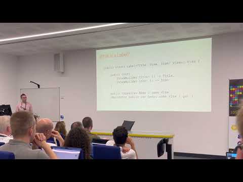
When working with design systems as engineers, we want to create styles that match the design resources while being composable and easy to use across many variations in our UI. In this talk Daniel Tull explains how we can make use of a SwiftUI approach to build extensible design systems without creating a load of difficult-to-manage custom views.
More talks are available from Daniel Tull here.
You can watch the talk on Youtube here.
Check out the useful post on Moving Parts also, Styling Components in SwiftUI.
Code
You can download an Xcode project with the code from this talk.
Notes
This post is mostly my notes from the talk, as well as code examples shown during the presentation.
What is a Design System
Design systems are a combination of processes, documentation, common resources and functional libraries.
A challenge is keeping these resources aligned with the way we develop in Swift apps, but thankfully Swift offers approaches that can make it easier to create shared vocabularity and components.
A common approach: Custom button
In Swift we can might want to create a primary button by creating a custom component such as:
struct PrimaryButton: View {

  let title: String
  let action: () -> {}

  var body: some View {
    Button(title, action: action)
      .font(.title)
      .padding(16)
      .background(.blue, in: RoundedRectangle(cornerRadius: 16))
      .foregroundColor(.white)
  }
}
This produces a button with a blue background as expected. However, there’s a downside to this approach. By creating custom components for each use-case, we end up with a lot of components to manage and keep track of.
The above code also doesn’t cover some issues, such as tap state, accessibility and more.
Another weakness of the above is when someone then decides we need a button with an image. We would create a second component, such as PrimaryImageButton. Over time this becomes tricky to scale and maintain and is a barrier to discovery.
Using buttonStyle
Instead of making custom components, buttonStyle is availble as a way of adding the styling we need to existing button components, rather than creating new components.
An example of a primary button style similar to the above might look like this:
struct PrimaryButtonStyle: ButtonStyle {

  func makeBody(configuration: Configuration) -> some View {

    configuration.label
      .font(.title)
      .padding(16)
      .background(.blue, in: RoundedRectangle(cornerRadius: 16))
      .foregroundColor(.white)
  }
}
This makes use of the same styling but instead of applying it to a Button, we make use of a label that is passed to the makeBody method in the configuration object.
The configuration also includes other angles such as tap events which can be configured here too.
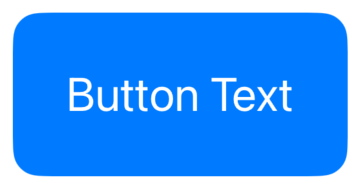
This could then be applied to a button using buttonStyle:
Button (
  "Button Text",
  action: {
  }
)
.buttonStyle(PrimaryButtonStyle())
Improving discoverability
To make it easier to discover this style, it’s possible to define static variable on buttonStyle that extend it like so:
extension ButtonStyle where Self == PrimaryButtonStyle {
  static var primary: Self { Self() }
}
The above sets a static variable primary that we can then apply to a Button by pressing . and it’ll suggest our static variable as an option:
Button (
  "Button Text",
  action: {
  }
)
.buttonStyle(.primary)
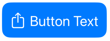
The above also supports any other Button usage out of the box, such as using it with an Image label or text alongside images.
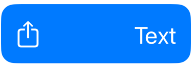
Extending Label styling
It’s possible to customise the styling of buttons further, such as adding space between the text and image on a button with both.
We would create such a button using both text and an image:
Button (
  "Button Text",
  systemImage: "square.and.arrow.up",
  action: {
  }
)
In this case, the Button component is making use of a Label version that accepts both text and image inputs corresponding to a Title and Icon view.
An example of such a Label used directly looks like:
Label {
  Text("Text")
} icon: {
  Image(systemName: "square.and.arrow.up")
}
labelStyle
Similar to creating a buttonStyle we can implement a labelStyle:
struct PrimaryButtonLabelStyle: LabelStyle {

  func makeBody(configuration: Configuration) -> some View {

    HStack(spacing: 100) {
      configuration.icon
      configuration.title
    }
  }
}
This styles the text and image to have a large amount of space between them.
We can use this as above to create an extension for a primary label style, or we can even use this directly within the PrimaryButtonStyle. This would mean any button using the .primary buttonStyle could make use of the above when using a label.
struct PrimaryButtonStyle: ButtonStyle {

  func makeBody(configuration: Configuration) -> some View {

    configuration.label
      .font(.title)
      .padding(16)
      .background(.blue, in: RoundedRectangle(cornerRadius: 16))
      .foregroundColor(.white)
      .labelStyle(PrimaryButtonLabelStyle())
  }
}
In the above we add the .labelStyle line and this will apply to any label that appears in a .primary buttonStyle button.
Button {
} label: {
    Label {
      Text("Text")
    } icon: {
      Image(systemName: "square.and.arrow.up")
    }
}
.buttonStyle(.primary)
Applying our style to custom components
So we can add labelStyle to our PrimaryButtonStyle but what if we have our own custom components to be used within a Button and we want to have them handled by our PrimaryButtonStyle too?
An example could be a button styled to have three different lines of text.
A less-ideal way to achieve this is to create a custom VerticalTextButton view containing a VStack of text. But as above, making new buttons is not the best approach. It lacks discoverability but also makes it difficult to customise the content.
An approach would be to create our own approach, which would have it’s own default style that can be extended in the same way as the buttonStyle or labelStyle.
Semantic container
Much as the Label could be described as a semantic container - a component that takes an icon and text and lets labelStyle decide how it looks, we can create our own container within which to create thie 3-line text button design.
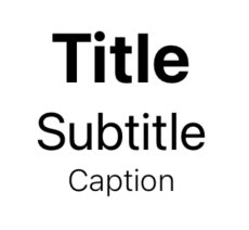
For the sake of this example, the semantic container being created is called Detail, and it accepts a set of three views: Title, Subtitle and Caption.
The code for this Detail is like this:
struct Detail<Title: View, Subtitle: View, Caption: View>: View {

  private let title: Title
  private let subtitle: Subtitle
  private let caption: Caption

  init (
    @ViewBuilder title: () -> Title,
    @ViewBuilder subtitle: () -> Subtitle,
    @ViewBuilder caption: () -> Caption
  ) {
    self.title = title()
    self.subtitle = subtitle()
    self.caption = caption()
  }

  var body: some View {
    VStack {
      title
      subtitle
      caption
    }
  }
}
This Detail view takes the three value views, and contains a simple initialiser and gives us back the three views as a VStack.
To set this up to receive our styling, we create a protocol:
protocol DetailStyle: DynamicProperty {

  typealias Configuration = DetailStyleConfiguration
  associatedtype Body : View

  @ViewBuilder func makeBody(configuration: Configuration) -> Body
}
Configuring with AnyView
We then set up configuration to pass each of the child views out to the caller for use when styling. It looks like this:
struct DetailStyleConfiguration {

  struct Title: View {
    let body: AnyView
  }

  struct Subtitle: View {
    let body: AnyView
  }

  struct Caption: View {
    let body: AnyView
  }

  let title: Title
  let subtitle: Subtitle
  let caption: Caption

  fileprivate init(title: some View, subtitle: some View, caption: some View) {
    self.title = Title(body: AnyView(title))
    self.subtitle = Subtitle(body: AnyView(subtitle))
    self.caption = Caption(body: AnyView(caption))
  }
}
This configuration is wrapping each of the given views in AnyView, which allows the view’s type to be dynamically updated when the configuration is used for styling.
This helps protect the component’s data from being exposed to the styling but mainly is set up this way to work with how generics in Swift are handled through protocols.
Adding to the environment
Next, to prepare for applying the detailStyle across the environment, the following code sets up a default “plain” style EnvironmentKey and extends EnvironmentValues to be able to get and set this key, and the View component to make use of it:
struct DetailStyleKey: EnvironmentKey {
  static var defaultValue: any DetailStyle = PlainDetailStyle()
}

extension EnvironmentValues {

  fileprivate var detailStyle : any DetailStyle {
    get { self[DetailStyleKey.self] }
    set { self[DetailStyleKey.self] = newValue }
  }

}

extension View {

  func detailStyle(_ style: some DetailStyle) -> some View {
    environment(\.detailStyle, style)
  }

}
Provide a default style
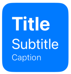
With the mechanism in place to apply detailStyle across views, we then define the default PlainDetailStyle mentioned above:
struct PlainDetailStyle: DetailStyle {

  func makeBody(configuration: Configuration) -> some View {
    VStack {
      configuration.title
        .font(.system(size: 32, weight: .bold))
      configuration.subtitle
        .font(.system(size: 24))
      configuration.caption
        .font(.system(size: 14, weight: .light))
    }
  }
}
This default exists mostly as a template for other users of this Detail view so that others can then create their own styles.
It’ll also allow us to remove the VStack we used above when initially setting up the Detail view. But first we need to create a way of properly applying the style across views.
Resolve style
In the blog post Styling Components in SwiftUI by Moving Parts, an approach to resolving styles in order to apply them to components is set out. A similar method can be set up to resolve the DetailStyle here:
extension DetailStyle {
  fileprivate func resolve(configuration: Configuration) -> some View {
    ResolvedDetailStyle(style: self, configuration: configuration)
  }
}

private struct ResolvedDetailStyle<Style: DetailStyle>: View {
  let style: Style
  let configuration: Style.Configuration

  var body: some View {
    style.makeBody(configuration: configuration)
  }
}
This lets use use environment properties, such as when a button is enabled or disabled. By extending our DetailStyle property we can ensure these environment properties are available within to be used our styles.
The above approach, which calls resolve in DetailStyle, can resolve it’s type at the point at which it is used so that the right style can be applied alongside keeping these environment values available.
Applying style to Detail
With these build blocks in place we can revisit the Detail view code from earlier and update it to make use of the detailStyle:
struct Detail<Title: View, Subtitle: View, Caption: View>: View {

  @Environment(\.detailStyle) private var style
  private let title: Title
  private let subtitle: Subtitle
  private let caption: Caption

  init (
    @ViewBuilder title: () -> Title,
    @ViewBuilder subtitle: () -> Subtitle,
    @ViewBuilder caption: () -> Caption
  ) {
    self.title = title()
    self.subtitle = subtitle()
    self.caption = caption()
  }

  var body: some View {
    let configuration = DetailStyleConfiguration(
      title: title,
      subtitle: subtitle,
      caption: caption)
    AnyView(style.resolve(configuration: configuration))
  }
}
In this case we have added a new @Environment variable, style, then within the body, used DetailStyleConfiguration to create the configuration, and then style.resolve to resolve this style into an AnyView.
Default style
We can now see all this in action:
Detail {
  Text("Title")
} subtitle: {
  Text("Subtitle")
} caption: {
  Text("Caption")
}
Creating PrimaryButtonDetailStyle
Now that we have a default style being applied, we can align it with the previous ButtonStyle approach by creating a Primary style:
struct PrimaryButtonDetailStyle: DetailStyle {

  func makeBody(configuration: Configuration) -> some View {

    VStack(alignment: .leading) {
      configuration.title
        .font(.system(size: 32, weight: .bold))
      configuration.subtitle
        .font(.system(size: 24))
      configuration.caption
        .font(.system(size: 14, weight: .light))
    }
  }
}
This is similar to the PlainDetailStyle above but contains an additional alignment to make the text items left-align.
We can then add this to the ` PrimaryButtonStyle``, to apply any time we use a Detailinside aButton:
struct PrimaryButtonStyle: ButtonStyle {

  func makeBody(configuration: Configuration) -> some View {

    configuration.label
      .font(.title)
      .padding(16)
      .background(.blue, in: RoundedRectangle(cornerRadius: 16))
      .foregroundColor(.white)
      .labelStyle(PrimaryButtonLabelStyle())
      .detailStyle(PrimaryButtonDetailStyle())
  }
}
Using Detail in a Button
We can then use the Detail view inside a Button and have it make use of the .primary buttonStyle:
Button {
} label: {
  Detail {
    Text("Title")
  } subtitle: {
    Text("Subtitle")
  } caption: {
    Text("Caption")
  }
}
.buttonStyle(.primary)
Convenience initialiser
We don’t want to make developers of the design system remember to use Detail view each time. A convenience initialiser can be used that accepts the title, subtitle and caption.
extension Button where Label == Detail<Text, Text, Text> {
    init(
        title: LocalizedStringKey,
        subtitle: LocalizedStringKey,
        caption: LocalizedStringKey,
        action: @escaping () -> Void
    ) {
        self.init(action: action) {
          Detail {
              Text("Title")
          } subtitle: {
              Text("Subtitle")
          } caption: {
              Text("Caption")
          }
        }
    }
}
This would then be simpler to use:
Button (
  title: "Title",
  subtitle: "Subtitle",
  caption: "Caption",
  action: {
  }
)
.buttonStyle(.primary)
Nesting styles
Using the Detail view inside a label within the styled Button even works, applying the labelStyle to apply space between the image and the “text” view, where the “text” is the Detail:
Button {
} label: {
  Label {
    Detail {
      Text ("Title")
    } subtitle: {
      Text ("Subtitle")
    } caption: {
      Text("Caption" )
    }
  } icon: {
    Image(systemName: "square.and.arrow.up")
  }
}
.buttonStyle(.primary)
This can be also wrapped in a convenience initialiser as above, so avoid having to specify the usage of the Detail view:
extension Button where Label == SwiftUI.Label<Detail<Text, Text, Text>, Image> {
  init(
    title: LocalizedStringKey,
    subtitle: LocalizedStringKey,
    caption: LocalizedStringKey,
    systemImage: String,
    action: @escaping () -> Void
  ) {
    self.init(action: action) {
      Label {
        Detail {
          Text ("Title")
        } subtitle: {
          Text ("Subtitle")
        } caption: {
          Text("Caption" )
        }
      } icon: {
        Image(systemName: systemImage)
      }
    }
  }
}
This could result in a simpler usage such as this:
Button(
  title: "Title",
  subtitle: "Subtitle",
  caption: "Caption",
  systemImage: "square.and.arrow.up",
  action: {}
)
.buttonStyle(.primary)
Making views optional
If you want to have flexibility to not have, for example, a caption, you can pass in EmptyView() to have it not show. Adding this inside a convenience initializer that simply doesn’t have a caption in it, then caption can be omitted from the above and it will just work as expected.
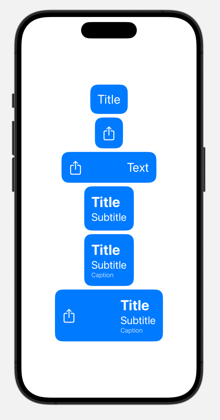
Examples of the Button in use
With these initialisers and a .primary Button style, some examples of use could look like this:
// Simple Button
Button("Title") {

}
.buttonStyle(.primary)

// Button with image
Button {

} label: {
    Image(systemName: "square.and.arrow.up")
}
.buttonStyle(.primary)

// Button with text and image
Button {

} label: {
    Label {
      Text("Text")
    } icon: {
      Image(systemName: "square.and.arrow.up")
    }
}
.buttonStyle(.primary)

// Button with title and subtitle
Button(
    title: "Title",
    subtitle: "Subtitle",
    action: {}
)
.buttonStyle(.primary)

// Button with title and subtitle and caption
Button (
  title: "Title",
  subtitle: "Subtitle",
  caption: "Caption",
  action: {
  }
)
.buttonStyle(.primary)

// Button with title and subtitle and caption and image
Button (
  title: "Title",
  subtitle: "Subtitle",
  caption: "Caption",
  systemImage: "square.and.arrow.up",
  action: {
  }
)
.buttonStyle(.primary)
You can download an Xcode project with the code from this talk.
Summary
Make use of custom styles rather than create views for each use cases. As the styles are composable, the styles can be nested for different contexts.
Then make use of semantic containers for custom components as they can be seamlessly combined with the composable styles.
Then make the standard types easier to use by using extensions to provide simpler APIs which handle the custom components.
Well that’s enough about me. Your turn!
Got any useful SwiftUI tips to share or questions about this post? You can message me on Mastodon, I’d love to hear from you.