When front-end developers tire of positioning, fonts, floats and divs, they make fun stuff. Stuff that probably only works in Chrome or similar. This is one of those times. Here’s a CSS-animated 3D phone:
3D Transforms
CSS3 includes some handy tools for rotating, moving and scaling within the 3D space. When you introduce transitions, you can animate and move things around in interesting ways.
Setting the stage
When creating a 3D object using CSS, the first thing to create is the container that holds the object. You can define this in the usual way, using width and height, and then specify a value for perspective. The perspective value is used to set the vanishing point that is then applied to any child objects. The smaller the value, the more dramatic the effect:
Putting together the pieces
One the container has been given a perspective, you can then set up the pieces that make up your 3D object. Positioning the pieces is done using the transform property. Transform is given a chain of effects, including rotate, scale and translate.
transform: effect1(value) effect2(value) effect3(value)...
As shown above, the effects can be chained. It’s important to keep in mind that they apply from left to right. Here’s an example:
transform: translateX(50px) translateY(50px) rotateY(45deg)
The above would translate the object along the X axis 100 pixels, then translate it along the Y axis 100 pixels, then rotate it 45 degrees. It should look something like this:
iPhone 5
Using the free iPhone5 template from Carter Digital, I cobbled together the front and side pieces. The side pieces needed some adjustment as all pictures I could find where at an angle.
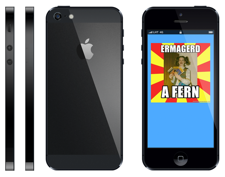
One area I had trouble with was the corners. Since they’re curved, I cropped the top and bottom off the side images, and replaced them with an angled black div. It’s a bit like a low polygon action game look, but it hides the gap where there should be a curved corner.
Try it for yourself!
Rather than explain setting up each of the pieces, here’s a chance to see each piece of the iPhone above being assembled. In the CSS code, uncomment each “/*” to see the associated piece of the phone animate into place. You can change the transforms and see the changes take effect on the displayed phone.
Animating the result
In this example I’ve added a drop shadow using CSS, and animated the entire phone using a couple of keyframes. To see this and more, grab the full iPhone CSS source for all the rules and browser prefixes.
Pull requests welcome
If you’re shaking your head at something I’ve messed up, I’m happy to receive pull requests on Github. You’ll find this entire site source code, but also the iPhone SASS and this post.
Update
Many thanks to Adam Lynch for adding the floating animation.
Please let me know if you have any questions or feedback. My email is d@hop.ie and I can also be reached on Mastodon at @donovanh.