Making use of the amazing background gradients in CSS to create a rich, full-screen banner that loads in less than half a second and is only around 2KB in size.
WWDC and iOS 7
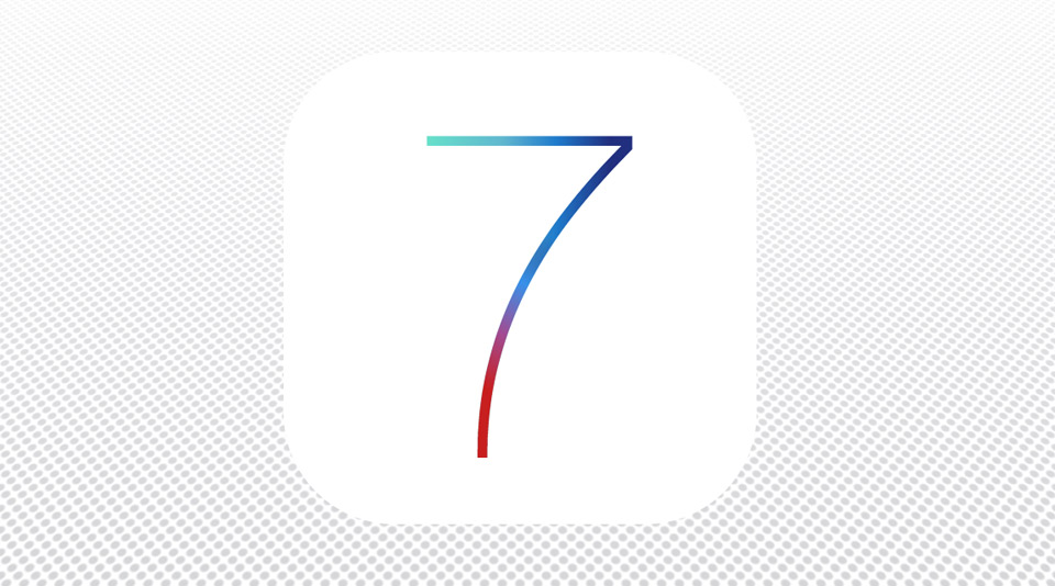
Apple have just revealed their latest iteration of the mobile operating system, iOS 7. In the run-up to the announcement at WWDC, they revealed an interesting banner that featured the number 7 against a dotted backdrop.
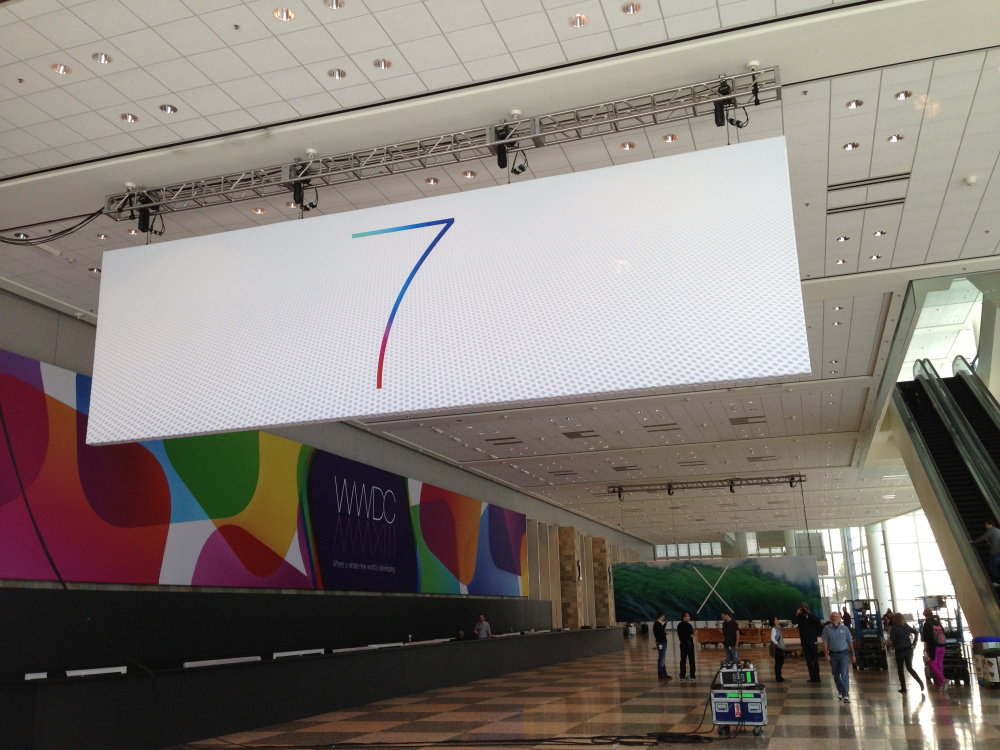
I liked this banner a lot. It’s a great combination of rich colours in the elegant, light typeface and an interesting, textured backdrop. It seemed like something that would make a great CSS project, so I had a go.
Turns out it’s indeed possible to create this banner using nothing but HTML and CSS, making use of CSS’s background gradients and 3D transforms. Let’s see how.
Compatibility
Since this demo makes use of the -webkit-background-clip and -webkit-text-fill-color, it’ll work well on Chrome and Safari. Until support for text-clipping in improves, it might not work so well in other browsers.
Source and demo
You can see the demo online, and download the source on Github.
Post-WWDC keynote update
When watching the keynote I noticed the 7 logo used inside a nice icon-shaped white box. I thought that looked pretty cool so have added it to the layout. Hiding the white background in the container element will make it look more like the banner above.
Making the 7
Aside from the extreme thinness of the font (Helvetica Neue UltraLight), it’s most striking feature is the colour gradients. To create this 7, we need to make use of CSS’s background gradient property, and then apply the gradient to the text.
Chris Coyier’s wonderful CSS-Tricks website has a great -webkit-background-clip snippet which will do nicely for the purposes of this demo.
First through, we need to set up some HTML to which we will apply the CSS:
<article class="container">
    <span class="text part1">7</span>
    <span class="text part2">7</span>
</article>
Here we have an article that contains two spans, each of which has a 7. The reason for including two 7s will become apparent in a moment. Before applying gradients, we set up these two spans so that they sit in an iOS-like icon in the middle of the screen.
The containing article is positioned and styled:
body {
    background: black;
}

.container {
  width: 512px;
  height: 512px;
  position: absolute;
  left: 50%;
  margin-left: -256px;
  top: 50%;
  margin-top: -256px;
  background: whitesmoke;
  border-radius: 120px;
}
This creates the container as a 512 by 512 pixel box and positions it in the middle, both vertically and horizontally, of the screen. The use of absolute positioning is not only a handy way of placing fixed-size elements in the centre of screens, it’ll also help when we introduce a background pattern later. For now the black background will provide contrast.
Next, set some properties for the text.
.container span.text {
    font-family: "HelveticaNeue-UltraLight", "Helvetica Neue UltraLight", Roboto, Arial, Sans-serif;
    font-size: 512px;
    position: absolute;
    top: 0;
    left: 124px;
}
The font is “Helvetica Neue UltraLight”, and I’ve added a fallback of “Roboto”. This is a free Google font that should be somewhat similar, for those systems that might not have the font available. The text spans are positioned absolutely, so that both 7s will sit directly on top of each other, and both are set to 512 pixels in size.
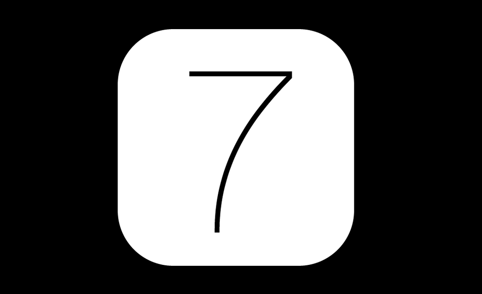
With the two 7s placed on top of each other, and the icon in place, it should look a bit like this:
Adding some colour
If you look closely at the photo above, you can make out two gradients in the number seven. The first is a red to blue going across the top bar of the seven. The second is a red, purple, blue gradient from the foot of the seven. Since there are two gradients, it’ll mean making use of both the 7s we added to the HTML.
I picked out several key points in the gradient across the top of the seven, and created some colour stops for the first of the two 7s. I’m using a webkit version of the background gradient rather than creating all the prefixes:
span.text.part1 {
    background: -webkit-gradient(linear, left top, right top, color-stop(0%, #67e1c9), color-stop(10%, #67e1c9), color-stop(40%, #60b6cf), color-stop(60%, #1f7acb), color-stop(80%, #212f7f));
}
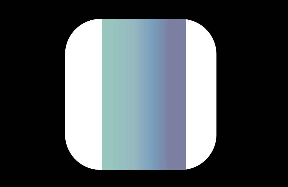
This gradient starts at the top left and has 5 color-stop values along the way. The gradient looks a bit like this:
While this is nice, it doesn’t apply to the number in the HTML. To achieve this, we use the background-clip and text-fill-color properties:
span.text.part1 {
    background: -webkit-gradient(linear, left top, right top, color-stop(0%, #67e1c9), color-stop(10%, #67e1c9), color-stop(40%, #60b6cf), color-stop(60%, #1f7acb), color-stop(80%, #212f7f));
    -webkit-background-clip: text;
    -webkit-text-fill-color: transparent;
}
The result of these properties being added should look like this:
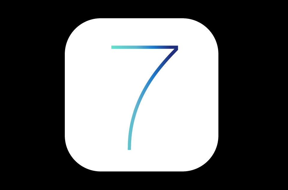
The next step is to apply another gradient to the second seven. Since this seven sits in front, it needs to have a gradient that starts red and ends transparent. Add some colour stops to achieve this effect.
span.text.part2 {
    background: -webkit-gradient(linear, left bottom, right top, color-stop(0%, #c71f1f), color-stop(30%, #c71f1f), color-stop(40%, #a24b92), color-stop(50%, #3791ea), color-stop(60%, rgba(33, 47, 127, 0)));
    -webkit-background-clip: text;
    -webkit-text-fill-color: transparent;
}
In this case the gradient starts at the bottom with the red colour, and ends with a fade to a transparent blue colour at around 60%. Transparent blue colour may seem like a contradiction, but the colour values in the R, G, and B of that RGBA have an impact on the gradient at it approaches transparent.
Now we’re getting somewhere:
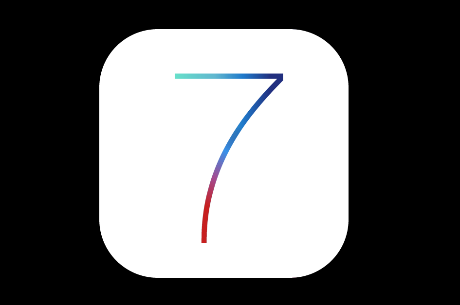
Next step is to create the fancy polka-dotted background.
Making the background
The background is a collection of dots that fade into white toward the top of the banner. There is also a subtle 3D effect, with the dots looking like they recede into the distance toward the top. To recreate this effect, we can make use of CSS’s 3D transforms along with the background radial gradients.
Banner
The background will need some HTML. Place the following before the container article in the HTML source:
<div class="background-container">
    <section class="background"></section>
</div>
This will make use of a background-container to contain the background and we’ll add the pattern CSS to the section contained within. First, place the background container in place with some CSS.
.background-container {
    width: 100%;
    height: 740px;
    top: 50%;
    margin: -370px auto 0;
    position: absolute;
    -webkit-perspective: 1200px;
    overflow: hidden;
}
The container is set to the full width of the screen, and 740 pixels high. It makes use of absolute positioning so that it sits in the vertical centre of the screen, behind the icon.
Since this container will contain a 3D-transformed element, it’s necessary to specify the perspective property. In this case I’m using the -webkit prefixed version. The perspective property sets the distance for the vanishing point in a 3D scene, allowing elements within it to be placed with the 3D space.
The overflow property is set to hidden so that we can make the background larger than it’s container.
We then set up the styles for the background itself:
.background {
  width: 300%;
  height: 200%;
  position: absolute;
  left: -100%;
  -webkit-transform-style: preserve-3d;
  -webkit-transform: rotateX(45deg);
}
The main background element is positioned absolutely, set to 3 times the width of it’s container and twice the height, then it’s rotated 45 degrees on the X axis. This has the effect of tilting it back, so that the bottom of the element will seem closer than the top.
The width and height are set to be so much larger so that the rotated section won’t leave gaps in the top left and right corners. Since the container has the overflow property set to hidden, the extra background won’t be seen.
Making the dots
Let’s make use of a radial gradient to create the pattern.
When a CSS radial or linear gradient is generated, it is created as an image on the fly by the browser. This means that it can be tiled and sized just like a background image.
We generate the dot texture as follows:
div.example {
    background: -webkit-radial-gradient(#d0d1d3 40%, white 65%);
    background-size: 14px 14px;
}
The resulting dot pattern looks something like this:

Rotation problem
Rather than apply the dot pattern directly to the background element, we need to adjust it to match the banner. The dots in the banner are a diagonal pattern, rather than the straight lines above. This would mean rotating the pattern 45 degrees around the Z axis. Since the background element has been tilted back 45 degrees already, rotating it on the Z-axis would not create the desired effect:
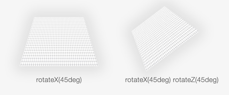
To get around this we can create a pseudo-element and apply the pattern to that. pseudo-elements can be added to an element to give us extra “elements” that we can style, referred to as before and after. Here’s the before pseudo-element:
.background:before {
    content: "";
    position: absolute;
    width: 300%;
    height: 300%;
    bottom: 0;
    left: -100%;
    background: -webkit-radial-gradient(#d0d1d3 40%, white 65%);
    background-size: 14px 14px;
    -webkit-transform: rotateZ(45deg);
}
The before element contains the pattern and is itself rotated 45 degrees on the Z axis. At this point it’s almost there, it needs the white gradient from the top of the banner. We can use the second pseudo-element to contain that gradient:
.background:after {
    content: "";
    position: absolute;
    left: 0;
    top: -60%;
    right: 0;
    bottom: 0;
    width: 300%;
    height: 200%;
    background: -webkit-gradient(linear, center top, center bottom, color-stop(0%, white), color-stop(60%, rgba(255, 255, 255, 0)));
}
The gradient on this pseudo-element starts at white and fades to transparent. It’s positioned a little above the top to allow for the tiled effect of the background element.
Putting it all together, we get something like this:
Smaller screens
Before finishing up, we need to make sure it looks good on smaller devices. In this case, I’ll add a media query to target phones so that it fits onto the screen.
@media only screen and (max-width: 350px) {
    .container {
        width: 300px;
        height: 300px;
        margin-left: -150px;
        border-radius: 80px;
        margin-top: -150px;
    }
    .container span.text {
        font-size: 300px;
        left: 70px;
    }
}
This adjusts the container to be smaller on screens that display fewer than 350 pixels horizontally.
Demo and get in touch
Check out the online 7 demo or download the source from Github.
Update: Lighter version!
Keith Chu has put together a great lighter version. It reduces the number of HTML elements and makes use of multiple backgrounds to reduce the amount of CSS.
I’ve included the lighter version in the github repo also for reference.
I love feedback. Reach me by email or on Mastodon.
