We have many tools manage and test how our front-end code works, but not so many to test how it looks. I’ve been looking for tools that make it easier to catch visual changes when working on CSS. One such tool is Wraith.
Testing responsive designs
While there are all sorts of ways to test back-end code, testing the way the front-end looks and works usually involves manually checking how pages look and feel at various sizes. Changes to CSS in one page might break other parts of the site, and it can be easy to miss issues.
There are many tools for testing front-end functionality, such as CasperJS. CasperJS drives a virtual web browser and stepping through interactions. While it can handle the functional testing of a site, it doesn’t test how a site looks.
Wraith
Wraith is a tool for testing responsive designs. It generates sets of screenshots, at various page widths, and compares a two versions to highlight differences. It then creates a gallery of thumbnails of both versions of each page.
The tool is built and maintained by BBC web developers Dave Blooman, John Cleveley, and Simon Thulbourn.
Installing
Wraith needs some other software in order to run. On Mac, I’d recommend using Homebrew to install these. If you’re using Windows, find instructions here.
First you’ll need to choose either PhantomJS (webkit based) or SlimerJS (gecko/Firefox). I have been using PhantomJS so far and it seems alright, but it’s up to you. You’ll also need to install ImageMagick.
brew install imagemagick
brew install phantomjs
You will also need Ruby installed.
Once you’ve done that, install the Wraith gem:
gem install wraith
The Wraith gem will now be available to use globally.
Setup
To set up an example and see Wraith in action, create the initial skeleton directories. Navigate to a test directory, and run the setup command.
wraith setup
This generates two folders, configs and javascript. The configs folder contains configuration for your tests, and the javascript folder contains a snap.js file that instructs Wraith how to operate PhantomJS and take the screenshots.
By default, this snap.js file will work well for standard web-facing sites. If you need cookie-based authentication or other options, have a look at this file. For now we’ll stick with the default. Instead, open the config.yaml file inside the configs folder.
#Headless browser option
browser:
  webkit: "phantomjs"
  # gecko: "slimerjs"

#If you want to have multiple snapping files, set the file name here
snap_file: "javascript/snap.js"

# Type the name of the directory that shots will be stored in
directory:
  - 'shots'

# Add only 2 domains, key will act as a label
domains:
  english: "http://www.live.bbc.co.uk/news"
  russian: "http://www.live.bbc.co.uk/russian"

#Type screen widths below, here are a couple of examples
screen_widths:
  - 320
  - 600
  - 768
  - 1024
  - 1280

#Type page URL paths below, here are a couple of examples
paths:
  home: /
  uk_index: /uk

# If you don't want to name the paths explicitly you can use a yaml
# collection as follows, and names will be derived by replacing / with _
#
# paths:
#  - /imghp
#  - /maps

#Amount of fuzz ImageMagick will use
fuzz: '20%'

#Set the number of days to keep the site spider file
spider_days:
  - 10
This file uses YAML to store the config options. Two domains are required, usually a local domain and a remote version. These URLs form the basis of a set of testing paths. The labels (home, uk_index, etc) are used to identify your page in the gallery generated later.
You can also specify any screen widths in pixels. A screenshot at each pixel width is generated, taking in the entire height of the page. Fuzziness is used to allow for small differences between the two pages.
I found the BBC URLs caused issues, so we will need to change a couple of things before this will work.
Adjusting the settings
First, change the domains to this:
# Add only 2 domains, key will act as a label
domains:
  english: "http://www.google.co.uk"
  french: "http://www.google.fr"
Then, remove the “uk_index” entry:
#Type page URL paths below, here are a couple of examples
paths:
  home: /
This will instruct Wraith to look up the Google UK and France landing pages, and compare them. Let’s try that!
Running
With the config in place, Wraith can be run with this command:
wraith capture config
The config part of the command refers to the config file we’ve just edited. If you have multiple config files, you can refer to them individually.
If all goes to plan, you should see a series of updates like so:
Snapping http://www.google.co.uk/ at width 320
Snapping http://www.google.fr/ at width 320
Snapping http://www.google.co.uk/ at width 600
Snapping http://www.google.fr/ at width 600
Snapping http://www.google.co.uk/ at width 768
...
cropping images
cropping images
...
Saved diff
Saved diff
...
Generating thumbnails
Gallery generated
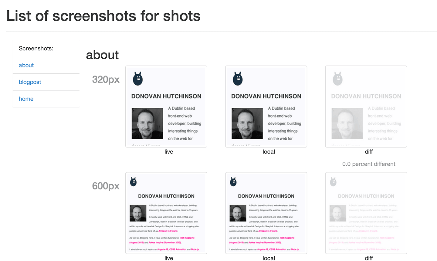
Open the generated shots folder, and you should see a gallery.html page. Open this in browser and you’ll be presented with a set of screenshots at various sizes, along with a third column showing any differences.
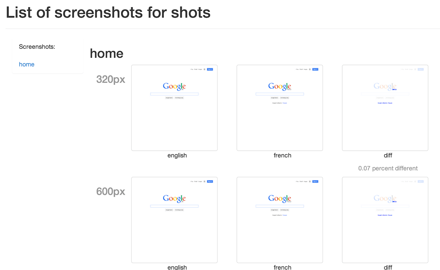
Flicking through these is a handy way to see any changes across the selected pages. The right column also includes a percentage difference between the two pages.
Running wraith capture config again will re-generate the images and overwrite any existing files.
Possible workflow
Once the initial shots folder has been created, and a set of pages added to the config, you will have a set of images documenting any visual changes to your pages. One approach might be to check these into your version control system. This would give you a visual history of all layout changes, tied to specific commits.
This may not be very practical though, as you may find if you’re creating many screenshots that it adds a lot of weight to your repository. Testing a few pages on this blog quickly resulted in 9MB of screenshots being pushed with each test.
At it’s most basic, the tool presents a useful way to quickly scan through a set of pages when working on the front-end and check that nothing has changed unexpectedly.
No passing or failing
This testing does not result in a green or red pass/fail result. Instead it offers a way to more easily manually check layouts. Other unit or functional test tools are better suited to continuous integration testing.
It’s also worth noting that the web drivers supported only include Webkit and Gecko. This means testing in other browsers, such as Internet Explorer, is not covered by this tool.
Live gallery example
I have started using this tool to check on this blog, you can see the results here.
Your process
Do you currently use tools to help with responsive design and flexible layout testing? Do let me know, I’d love to hear what works for you.